


As 2020 drew to a close, UI/UX design trends in 2021 were heading in an exciting new direction. One where simple interfaces meet with high-powered, high-performance trends like AI, 3D, as well as Virtual Reality and Augmented Reality.
Then the pandemic came along – and with it, a whole new base of users reliant on easy-to-use technology and tools. Designers were forced to shift gears. Accessibility became the priority. Simple navigation, large typography, and clear directions were critical (even life-saving).
And while we haven’t seen the last of 2021’s UI and UX design trends, the impact of that accessible Covid-centric approach is likely to be felt across the UI/UX world for some time.
Here are the UI and UX Design Trends and methods that we apply in 2022, let’s take a look at the latest UI and UX trends that will dominate this year and get you your users’ attention, as well as impact your design style.
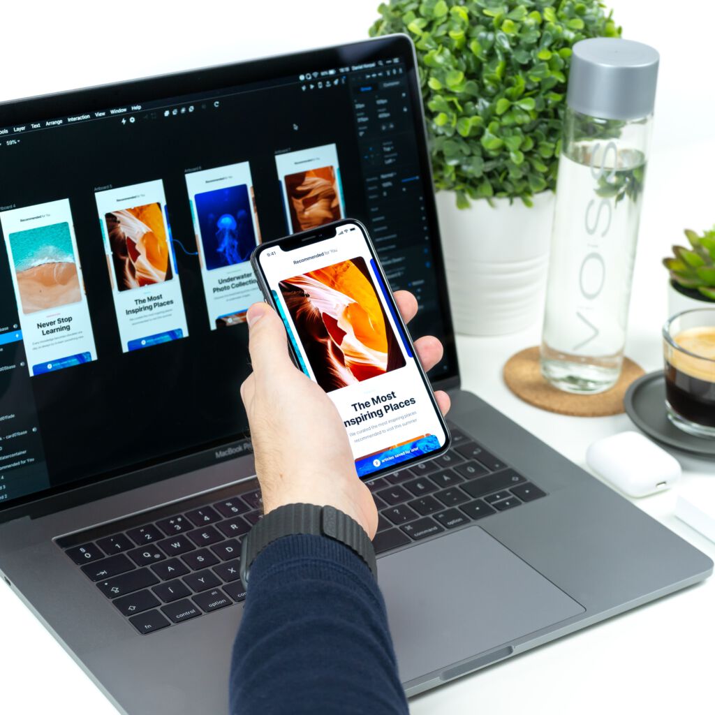
1. More apps & sites will feature dark mode
Dark mode has been around, in one form or another for a long time, but it was Apple’s 2018 Mojave update that really brought it to the mainstream. Since then, not only is it available in iOS, but it’s been implemented by e-commerce leader Amazon, as well as Microsoft, Google, and many more. And for those apps and platforms where it’s not available, users can just download a browser tool like Dark Reader to force the switch.
Dark mode as a ui trend,
There are tons of great reasons to introduce (or smarten up) your dark mode feature. For instance, it can help improve the battery life of devices and help reduce the dreaded ‘blue light’ that keeps our brains awake at night.
On the UI UX design side, dark mode’s high contrast has the advantage of making texts more readable. It can also help enhance colors and details in images and videos. It also reduces eye strain, making it a compassionate feature which is also useful for user retention.
That being said, it’s not as easy as running with a negative palette swap. Designers need to account for the fact that black-colored text featured on images can disappear if the user switches on Google Chrome’s dark mode.
2. Micro-interactions are key
We know that animation is coming in a big way, but micro-interactions are also a major tool in our UI and UX design kit, especially for those working in the mobile realm.
Small-scale graphics and animations, such as loading bars, are proving an excellent way to engage users. Want to show them that you’re processing their request? Add a loading bar. Need to point them in the direction of a new message? A ringing bell notification might be just the ticket. We advise you to use micro-interactions to grab users’ attention, inform users, and direct them where they need to be (or where you want them to go).
3. Strong emphasis on usability continues
You’re not the only one thinking about how to improve the user experience. Google is also considering how to enhance UX, revealing three new usability metrics. Known as Core Web Vitals, it’s ‘an initiative by Google to provide unified guidance for quality signals that are essential to delivering a great user experience on the web.’
The three metrics are:
– Largest Contentful Paint (LCP)
LCP measures loading times – with 2.5 seconds being the maximum effective amount of time a user should have to wait.
– First Input Delay (FID)
FID checks how long interactions take to engage – so, the time between someone clicking the ‘Add to Cart’ button and the product actually being added (and the user informed). 100 milliseconds or less is best.
– Cumulative Layout Shift (CLS)
CLS focuses on visual stability, with your pages maintaining a CLS of 0.1 or less.
4. Simplifying user journeys & information architecture
Keep it simple.
Since the start of the pandemic, we’ve seen plenty of companies introduce new features and services to help users. But the unpredictable nature of the pandemic meant that designers and developers had to act fast and deliver quickly. So, while these are functional, they don’t always provide the best user interfaces.
As the world gets back on its feet, 2022 offers a chance to finally refine these additions, making them as aesthetically pleasing as they are usable – rather than some bolted-on Frankenstein’s monster of a feature. The challenge, then, will be adding more services and features, without impacting the overall experience. Indeed, it’s not enough to simply maintain. Apps and pages need to be streamlined, simplified, and uncomplex (at the front-end, at least).